Objective
Visualize the data modeled in Phase 2 through an interactive map interface, making the insights accessible and intuitive for users to understand.
Initial Challenges
- Complex geospatial visualization requirements
- Limited experience with GIS tools
- Learning curve of tools like ARCGIS
- Need for interactive data presentation
Solution Approach
- Utilized PowerBI for visualization
- Implemented heatmap add-ins
- Created live map of Cape Town
- Color gradient visualization
Visualization Features
Quality of Life Gradient
Color-coded visualization from green (optimal) to red (suboptimal) areas
Interactive Map Interface
Users can explore different areas and view detailed metrics for each region
Real-time Data Updates
PowerBI integration allows for dynamic data visualization and filtering
Technical Implementation
After evaluating various geospatial visualization tools, PowerBI was chosen for its balance of functionality and ease of use. The heatmap visualization effectively communicates complex data through an intuitive color-coding system.
Visualization Results
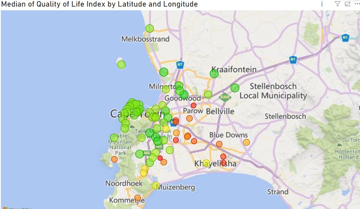
Quality of Life Index visualization across Cape Town. Green dots represent areas with higher quality of life scores, while red dots indicate areas with lower scores. The visualization clearly shows the geographical distribution of living standards across the city.