This phase focused on transforming raw feeding statistics into meaningful visualizations, helping volunteers see the direct impact of their work through real-time data.
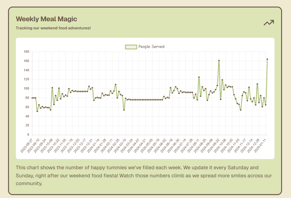
Weekly Meal Magic: Tracking our weekend food adventures! The graph shows the number of happy tummies we've filled each week.
Why a Graph?
One of the main goals of the website is to show volunteers the real impact they're making. By displaying the number of people fed each week on a graph, they can easily see trends over time. This quick visual helps the team look at how demand is changing and can even help plan for the next week's supplies, making sure we're ready for any increases.
Fetching Data with Prisma
To build this chart, I needed all the data entries from the database. That's where Prisma came in again, making it super easy to "fetch" or grab all the records. Instead of writing a complex query, I could use a simple command in Prisma to pull every weekend's feeding data.
Line Chart Implementation
With the data in hand, I used a line chart module to create the visual. Line charts are perfect for showing trends over time, so this was an ideal choice. The x-axis shows only weekends since those are our feeding days, keeping the visualization clean and focused.
Key Visualization Features
- Real-time data updates every weekend
- Clear trend visualization over time
- Weekend-only data points for clarity
- Interactive tooltips showing exact numbers
- Responsive design that works on all devices
- Color-coded for easy readability